Color
The Resonance palette uses saturated pops of color in a light interface to create a fresh look that makes for a friendly and inviting space. By carefully assigning colors to action items or highlighted areas, the main focus remains on the content. To keep the interface feeling light and calm, saturated tones should take up no more than 15-20% of the page at any time.
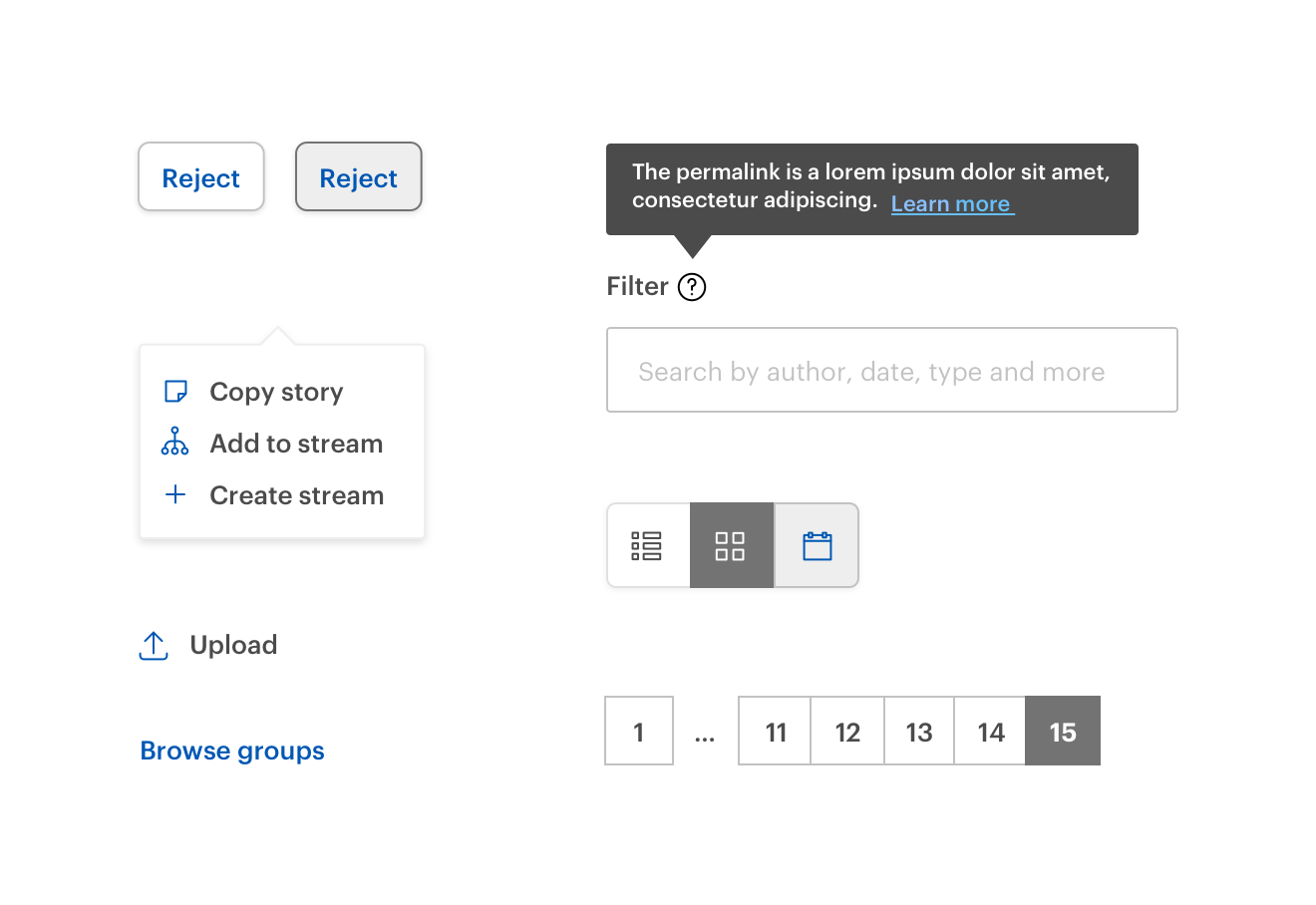
The lightest tints are used for subtle highlighting. Neutral colors (the Gray colors as well as white) are added to neutralize certain areas and to establish space. The grays are used as either background colors or for secondary action items.
Usage guidelines
While the Resonance palette contains many saturated colors, use of the 500 values should be limited. Implementing a restrained palette of neutral grays with pops of color for important actions creates a more effective hierarchy than a page covered in a rainbow of colors.
Primary color
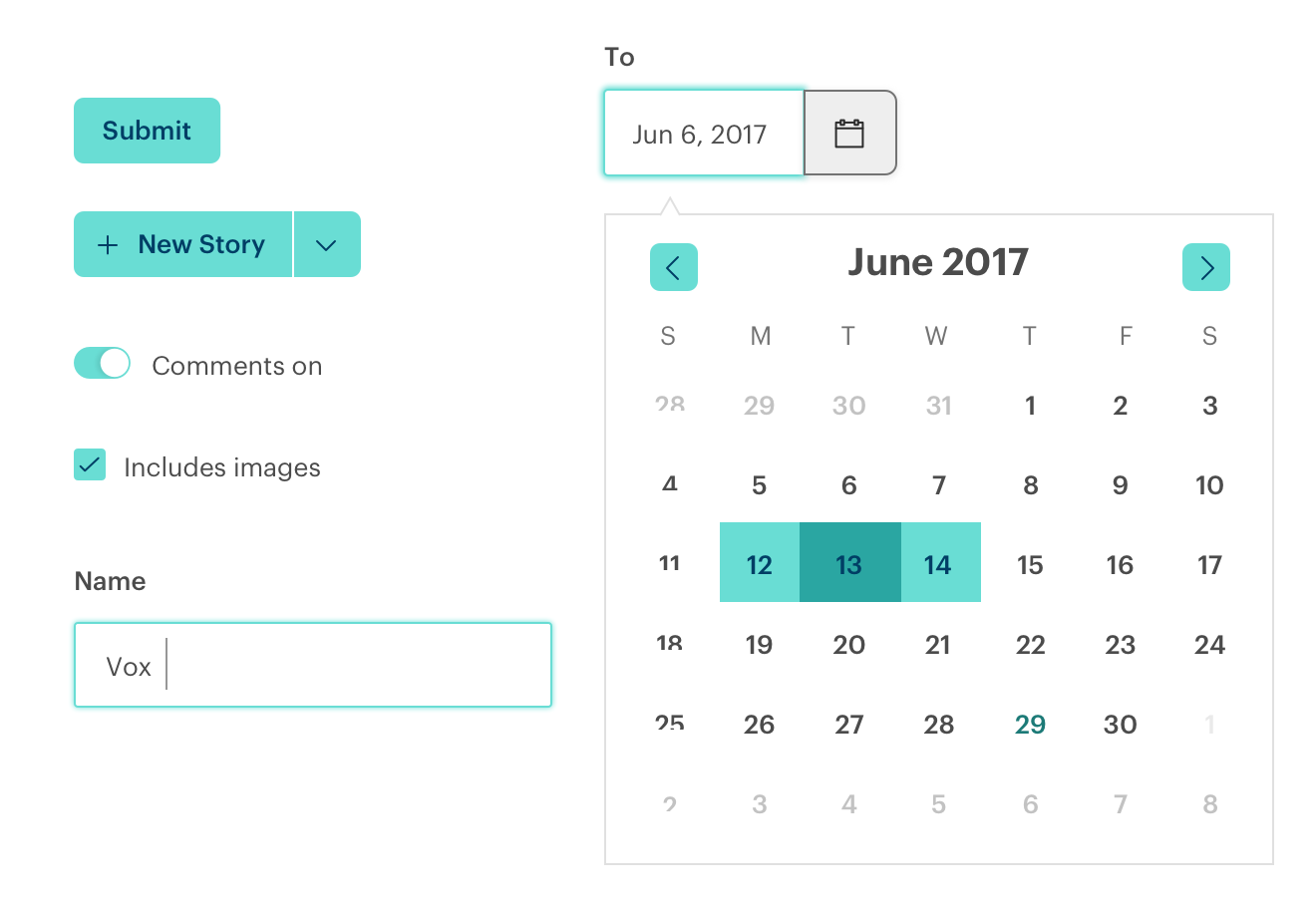
Resonance uses Jade 400 as the primary color. The primary color should be used as the main interface color. This applies to fundamental primary UI components such as buttons, checkboxes, and focus states.
To have sufficient contrast against Jade 400, our primary components use Sky 700 as the contrasting accent color. This applies to button text, icons, and any other critical parts of a component that need high contrast against Jade 400.
Secondary color
Resonance uses Sky 600 as the secondary color. The secondary color should be used for components that are secondary in action and when a layout calls for less attention than primary components, such as standalone links and standalone icons. Used alongside the primary color, this creates a dynamic system for creating a visual hierarchy. The colors are used in a systemic way denoting primary and secondary components, and this is maintained across the Resonance ecosystem. As such, given a pair of related primary and secondary UI elements, the primary one should use the primary color, and the secondary one should use the secondary color. This includes contexts other than Resonance components; when designing interfaces outside of components, don't use the secondary color for information that is hierarchically primary (or vice versa).
Neutrals
Resonance was optimized to work against light backgrounds. Our primary and secondary colors shine against white, Gray 100, and Gray 200 backgrounds. Use changes in neutral colors to give dimensionality to the page. These changes should lean towards being subtle. Neutrals should comprise at least 80% of the page.
Status colors
Resonance uses Grass to signal a positive or successful action, and Apple to signal a warning or error. These colors should only be used in the context of a status.
Recommendations
- Use a good balance of neutrals and other colors. Neutrals should make up the majority of the page to allow the most important UI elements to shine.
- Use the most eye-catching colors sparingly.
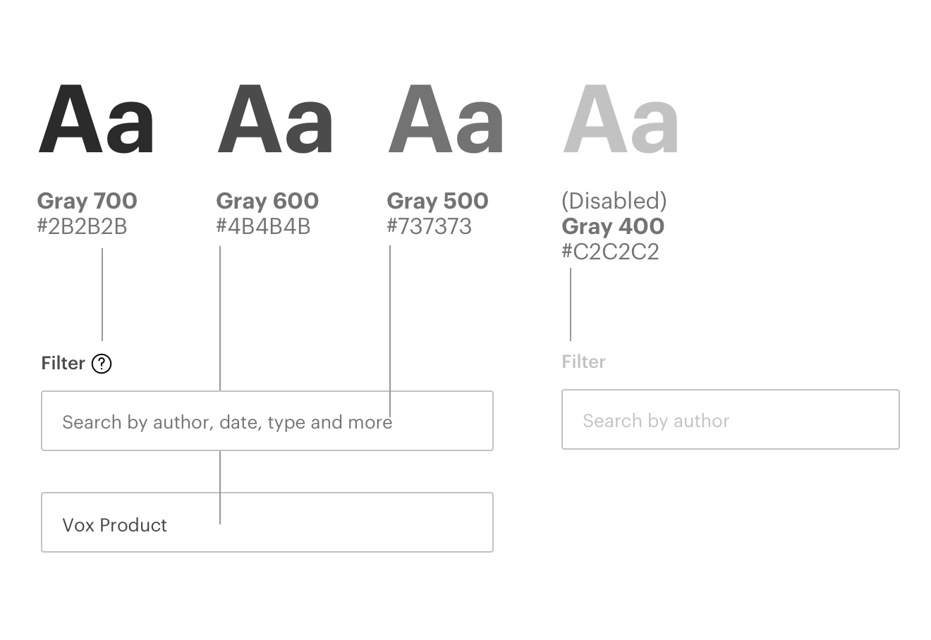
- Default text starts at Gray 600 with the ability to go darker for titles, and lighter for labels or tags. Gray 400 is used for disabled text.
- Avoid using only Grays, as the page can look stagnant and unfinished.
- Avoid repurposing status colors outside of their intended meaning or replacing status colors with different colors.
- When using text of a color other than a Gray, the background should be either a neutral color or a lighter tint of the same color as the text.

Accessibility
The current Resonance color palette has been tested to work with WCAG 2.0 accessibility standards.
When pairing text with color, be mindful of contrast rules. All of the colors in the palette are designed to work with either white or Gray 500 and above text.
Please test for contrast regularly when combining colors.